Microsoft found itself in a bind after the launch of Windows 7. Struggling for relevance in the mobile sector, the company attempted to fill the void in its portfolio by adding a touch-friendly UI layer over the Windows desktop. However, Metro came with a myriad of issues and complaints, mostly because of poor choices in usability design -- part of what we've been hoping Microsoft will fix in Windows 8.1. And it has, somewhat.
Despite that and the fact that a single-year turnaround for any kind of Windows iteration is quick for the folks at Redmond, we're not sure if it's enough to please detractors. Before installing the free upgrade next Thursday, let's review what's been improved and what's still missing.
+
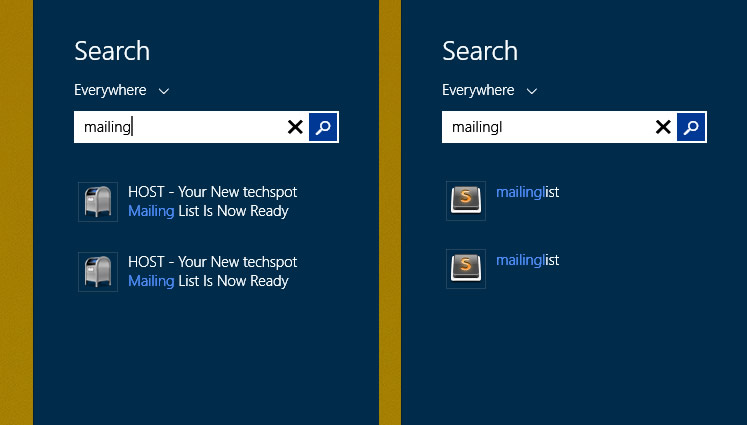
Windows search is much improved, but still far from perfect
When I reviewed Windows 8 I criticized its broken down search, as it
didn't make sense to separate documents from settings if search was
meant to be used as a keyboard launcher. Windows 8.1 fixes this with
universal search that works well most of the time, including some
semantic search capabilities (queries don't need to be keyword-exact).
However if you've used OS X, you'll note that Mac maintains its upper
hand with more seamless and useful results. For example, OS X can
remember your preference of a previous query and make that result more
prominent in future searches with less keystrokes.
+
The Start button is back
As you've read dozens of times by now, it's just the button, not the
menu, though the handy right-click menu with power user settings and
shortcuts is still present. Returning the Start button is a positive
change and works best when you configure the Start screen with your most
used apps and shortcuts. However...
-
The Start screen is still a pain to configure using a mouse
While the addition of smaller and bigger tiles enhances the overall
experience compared to what we got in Windows 8, the Start Screen still
can't be manipulated fluidly if you wish to add, move or remove tiles.
Newly installed programs are not added to Start automatically, which can
be both good and bad, but without proper integration of Start and
desktop apps, interaction between the two remains broken.
-
The "All programs" screen
Microsoft's answer to the divorce between desktop apps and Start
tiles is the "All programs" screen which I find horrible to browse
because it's cluttered with countless redundant shortcuts for help
files, uninstallers, readmes and other nonsense. It feels like you're
scrolling through every single shortcut from your old Programs menu.
+
Shared wallpaper in desktop and Metro UI
It's a shame Microsoft doesn't make this the default setting as it
represents a major improvement in the way Metro and the desktop blend
together. The "modern" UI was forced into Windows 8 and that's why a lot
of people have avoided the OS. The design languages are very different
and making them co-exist amicably is something Microsoft hasn't figured
out entirely, but the wallpaper integration alone makes 8.1 worth
installing. Bonus: the ugly flower wallpaper is no longer the default.
+
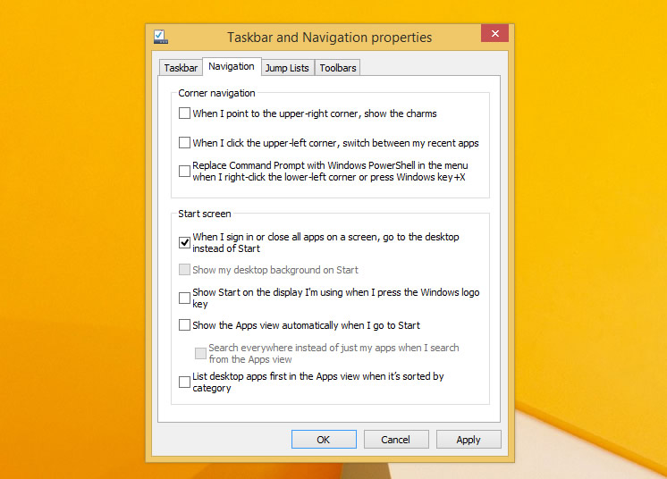
Boot to desktop and configurable hot corners
Thank you, Microsoft. You now get the option to boot directly to the
desktop, even if it's not a prominent setting, it's accesible from the
taskbar properties. Hot corners can be disabled which makes sense if you
are a desktop power user with multiple monitors. The change helps you
forget about Metro if you don't want to see it. But...
-
Hot Corners are still forced in other areas
Personally, I've disabled all hot corners but Charms. I also hate
Charms, or rather I find them irrelevant to my workflow. A welcomed
improvement would have been to detect if you are running a desktop,
laptop or tablet and show contextually relevant menus. Seriously
Microsoft, how hard can it be? For example: show advanced networking
options on a PC including control panel integration, show brightness
settings on a tablet/laptop, disable the "share" option when you are not
in a Metro app, and so on.
+
Largely improved default Metro apps and Help
The new Skydrive app gives an Explorer-esque way of handling files
from the Metro UI. Skype looks great and replaces the old Messaging app.
Mail is also better, albeit still very limited. Also, you get a wider
variety of options in the settings menu and many visual aids that
explain how to get around the OS. These last two translate into a
friendlier way to configure and use a Windows 8 PC for less experienced
users.
-
Default file associations to Metro apps
Metro apps are set as defaults for opening PDF, images, and other
popular file formats, even though they aren't optimized for mouse
navigation, you typically can't manipulate files (copy, paste, print,
move windows) and it's not intuitive to bounce in and out of Metro when
doing actual work.Solution: Same as with Windows 8: install and configure your favorite desktop apps as the new defaults. Even Windows' built-in desktop programs will do the trick. While annoying having to configure this, mark my words, miss one file format and you'll hate Windows 8 a little more every time it forces you back to a vanilla Metro app.
+
Installing high quality apps from the Windows Store
The Windows Store looks pretty good on its current iteration. When it
works right (e.g. Halo Spartan), installing apps from the Store feels
magical. It's as if PCs were always meant to work like this. Two clicks
and boom, you're running your new program.If you have selected a large app, the download will start on the background. A subtle status notification will tell you when the program is done downloading, installing and ready to run. Choose to run the newly installed program from the notification and it will launch the new app in a visually smooth transition. Like I said, magical.

-
All those Metro apps that don't have a reason to exist
"When it works right" being the key phrase here. A thorough
transformation is required if we'll ever see Metro become as powerful or
useful as the desktop. A majority of apps that belong to a web service
offer a lesser experience than their browser-based counterparts. On some
occasions they aren't official apps and Microsoft isn't doing enough to
clean up that mess (e.g. there are several unofficial and somewhat
shady YouTube apps).
Having used Windows 8.1 preview/final for months, I think it's a must-have for those already running Windows 8. At the very least, it polishes some of the roughest edges with Metro's integration and it won't cost you a cent.
No comments:
Post a Comment