You
took the first step — buying technology. Now all you have to do is
master it. We’re here to help, with tips and tricks you may have missed.
If you know them already — well done, guru! If not, there’s no better
time to start learning than right now.
Skill Level: Beginner
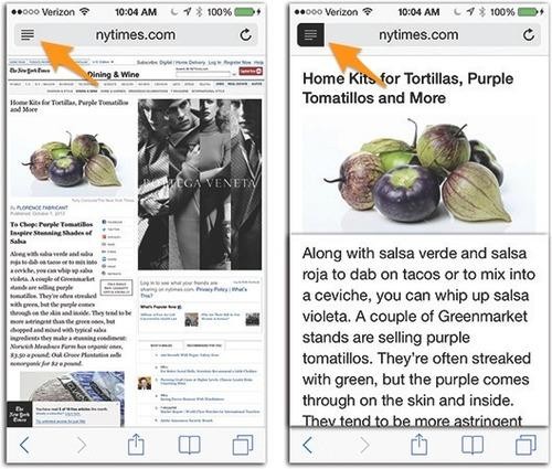
For Internet surfing on the iPhone, the Reader button in the Safari address bar is amazing. With one tap, it eliminates everything
from the webpage you’re reading except the text and photos. No ads,
toolbars, blinking, links, banners, promos, or anything else.
The
text is also changed to a clean, clear font and size, and the
background is made plain white. Basically, it makes any webpage look
like a printed book page, and it’s glorious. Below: the before and after. Which looks easier to read?

To exit Reader, just tap the Reader button again. Best. Feature. Ever.
The fine print: Reader doesn’t appear until the page has fully loaded. It doesn’t appear on “front page” pages, like the yahoo.com
home page — only when you’ve opened an article within. It may not
appear on sites that are already specially designed for access by
cellphones.
But when Reader does appear, you can tap it to get a better view on the iPhone Web.jahsent932.blogspot.com
No comments:
Post a Comment